About Wishpond
Wishpond is a Vancouver-based marketing company that offers a complete digital marketing software suite, featuring landing pages, popups, contests, email marketing, and marketing automation. Wishpond also offers businesses a fully-managed option, providing them with a team of marketing experts to generate leads and drive sales.
Project Overview
For this project, I was responsible for leading a team in planning and executing a complete website overhaul. This was a large undertaking, and it corresponded with Wishpond’s movement towards becoming a software-service hybrid. As a team, we updated Wishpond’s visual branding, redefined its product offering, and changed the website’s entire user flow.
Colours & Fonts
To cement Wishpond’s place as a modern marketing company, we completely overhauled its branding and visual standards.
We first updated Wishpond’s colour palette, using Material design standards to create a new set of colours for the brand. We chose a vivid blue as a primary colour, and a bright yellow and green as contrasting secondary colours. We also leaned heavily into gradients for Wishpond’s updated visual identity.
Next, we chose a new font, moving to Circular from the oft-used Open Sans. We chose Circular for its “friendly” look and its versatility–we found it worked well for both headings and body copy.
Imagery
For Wishpond’s home page, we opted to use a photo composed of objects around our office and a screenshot of the Wishpond platform itself. We wanted to achieve two things: to introduce the Wishpond product to a new visitor, and to let a little bit of the company’s personality and culture shine through.
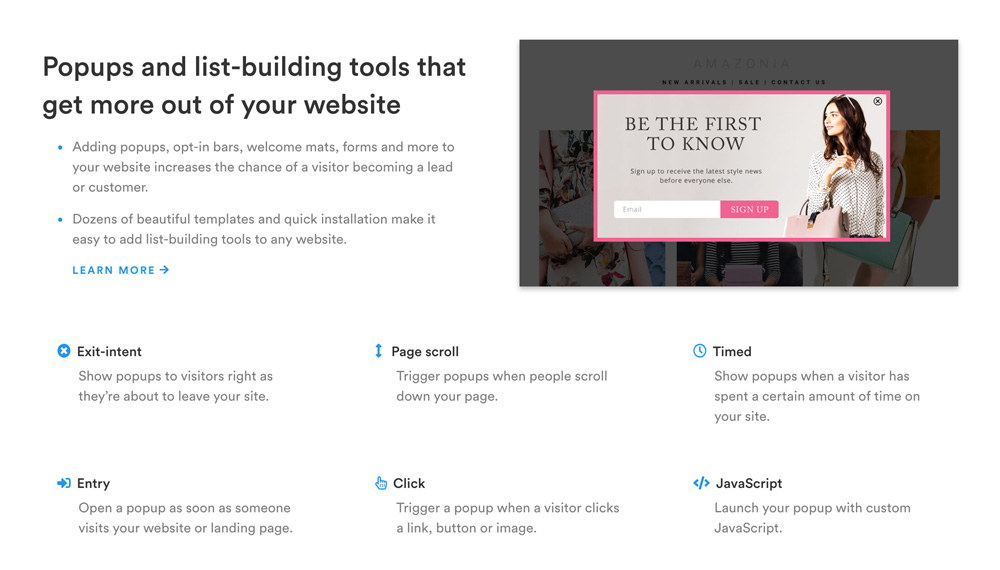
For product pages, we used large screenshots with drop shadows to add depth. We wanted to ensure a visitor could attain a reasonable understanding of the platform through imagery alone.
Copywriting
The copy we created for the Wishpond website was both product and benefit-focused (“Landing pages that maximize your lead generation“). Because Wishpond’s target market is comprised of people from small business owners to enterprise-level marketing teams, we found it important to give visitors enough information, regardless of their level of knowledge.
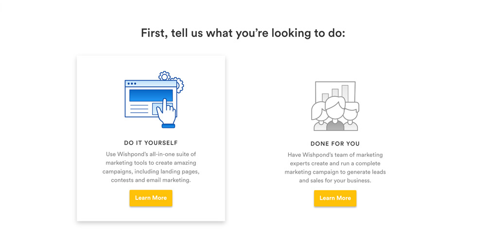
Visitor Flow
Because Wishpond was transitioning to a software-service hybrid, we needed to redesign the user flow from the ground up. We revamped the home page to provide a more guided experience, requiring users to self-segment upon arrival between self-service (“Do It Yourself”) and fully-managed (“Done For You”).
We built the home page to change based on each visitor’s choice. If they selected “Do It Yourself”, they would see an overview of the Wishpond platform; if they selected “Done For You”, they would be presented with a general outline of the fully-managed process. Calls-to-action also changed–self-service visitors would be directed to pricing or signup, while fully-managed visitors would be asked to book a demo with a Wishpond salesperson.